
Media
Image
A single responsive image with an optional link and caption.
Live demo
See it in action
Default
Responsive image
Scales to fill its column and keeps its aspect ratio — the everyday image, now a self-contained responsive rule (no Bootstrap .img-fluid).

Sizing
Fixed width
Cap the width (420px) and the height follows the ratio. Centered in its band.
Sizing
Exact crop
Set BOTH width and height in px (480 × 320) and the source is cropped to exactly that box.

Link
Clickable image
Add a link and the whole image becomes clickable — optionally opening in a new tab.

Styling
Framed with a background
The Styling tab adds a background colour and padding for a clean frame — plain wrapper classes, no utilities.

Focal crop
Square crop (1:1)
Set an Aspect Ratio and the image is cropped to fill it — here a 1:1 square (Fit = Cover). Great for lining up mismatched photos.

Focal crop
Widescreen crop (16:9)
The same source cropped to 16:9 — Cover trims the overflow to fill the frame, no letterboxing.

Crop position
Keep the top
Crop Position works like a background-image position. This tall photo is cropped to 16:9 keeping the TOP (Crop Position = Top).

Crop position
Keep the bottom
The exact same photo and 16:9 crop — but Crop Position = Bottom keeps the lower part in frame instead.

Caption
A captioned figure
Add a caption and the image is wrapped in a semantic figure element with a caption beneath it.

Lightbox
Click to zoom
Turn on Lightbox and clicking opens the full-size image in an overlay — no plugin, shared with the Gallery.

Image style
Rounded corners
Apply the Rounded preset from Theme Settings → Components → Image Styles for soft, rounded corners.

Image style
Pill shape
A new Pill preset in Theme Settings → Components → Image Styles gives the image fully-rounded ends.

Screen Preview
Auto-scrolling screenshot
Turn on Screen Preview to frame a long screenshot as a browser window; an Animation Engine Marquee (direction Up, Gap 0) scrolls it on a loop, and the Pause / Play button keeps it accessible.

The markup
Clean, lean code
This is the exact HTML the element outputs, straight from the page builder. No wrapper soup, no inline-style bloat.
<section class="fw-flexbox fw-flex fw-contained fw-collapse">
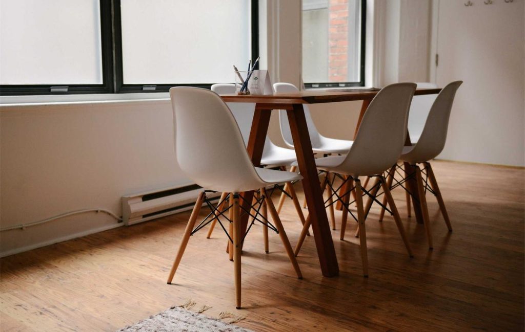
	<img width="1024" height="649" src="https://demos.unysonplus.com/wp-content/uploads/2026/09/demo-8f61914ca18b-1024x649.jpg" class="image media-image__img" alt="" decoding="async" loading="lazy" srcset="https://demos.unysonplus.com/wp-content/uploads/2026/09/demo-8f61914ca18b-1024x649.jpg 1024w, https://demos.unysonplus.com/wp-content/uploads/2026/09/demo-8f61914ca18b-300x190.jpg 300w, https://demos.unysonplus.com/wp-content/uploads/2026/09/demo-8f61914ca18b-768x486.jpg 768w, https://demos.unysonplus.com/wp-content/uploads/2026/09/demo-8f61914ca18b-600x380.jpg 600w, https://demos.unysonplus.com/wp-content/uploads/2026/09/demo-8f61914ca18b-395x250.jpg 395w, https://demos.unysonplus.com/wp-content/uploads/2026/09/demo-8f61914ca18b.jpg 1200w" sizes="auto, (max-width: 1024px) 100vw, 1024px" />
</section>
To learn more about the Image shortcode, please check out the online manual here.