
3D Gallery · Carousel & Flow
Carousel Flow
A flat focus carousel — full-size centre card, scaled-down faded side cards.
Example 1 · Entrance + pause on hover
Focus carousel, pause on hover
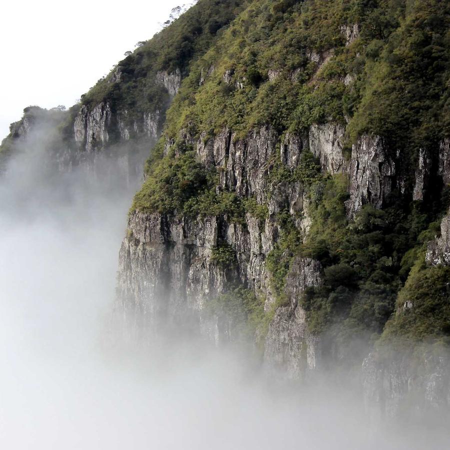
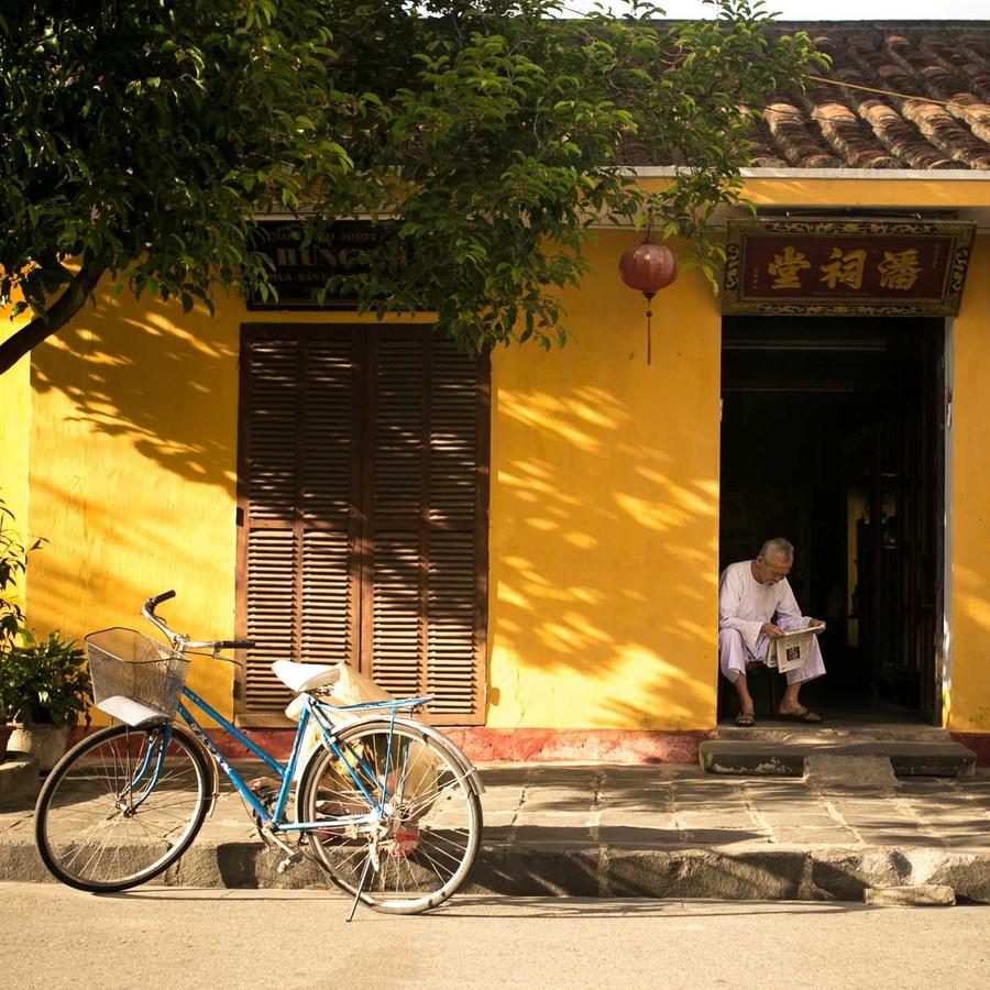
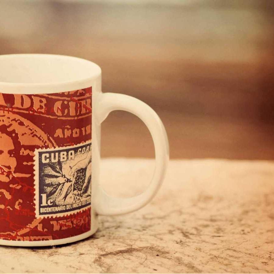
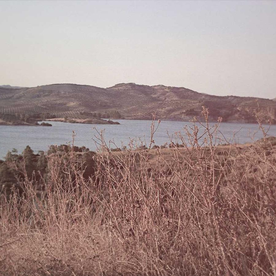
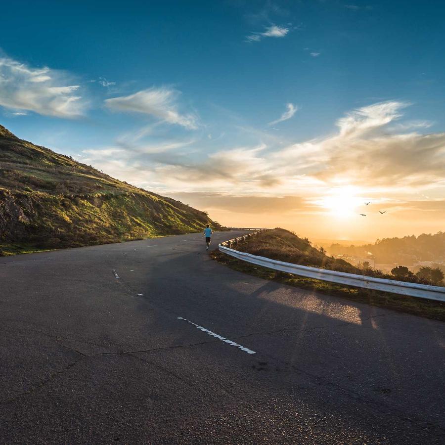
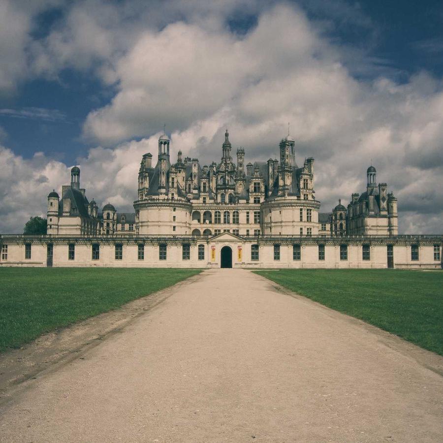
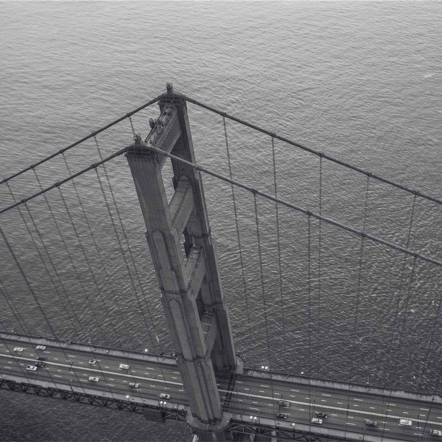
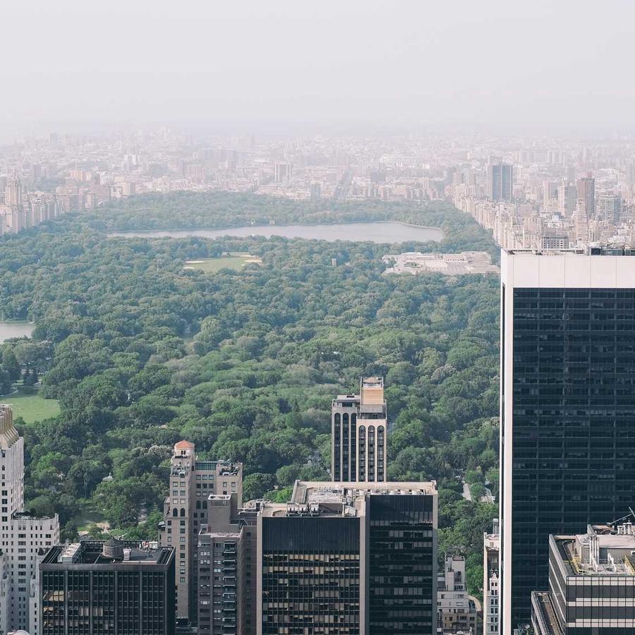
A flat focus carousel — centre card full size, side cards scaled down and faded. The whole carousel zooms in on load; Motion → On Hover is Pause. Click a card to open the lightbox.




Example 2 · Vertical
Flowing vertically
The same carousel set to Vertical orientation — cards slide up/down through the centre focus.
Example 3 · Tiny sides
Side cards shrunk away
A low Side Card Scale (40%) shrinks the flanking cards right down, so the centre card dominates with just a hint of the neighbours.
Example 4 · Peek carousel
Same-size peek
Side Card Scale at 100 keeps the neighbours full size, with a wider gap — a row of equal cards peeking in from both sides.
Example 5 · Ratio & corners
Widescreen cards, soft corners
Widescreen 16:9 cards (the default is square) with rounded corners. Click a card to open it full-size.
Docs & Playground
Tweak every option live
Play with all of these settings in real time and read the full option reference in the manual.
Free & open source
Build with this element, free.
Install the framework and the Bootstrap 5 theme, then drag this element into any page.